Colours
This year we see a continuing move towards colours that are cleaner in character and much more optimistic and hopeful in the feeling they create. Shades for 2011 bring joy and charm to our lives and create an overriding mood of clarity and freshness in all palettes.
-
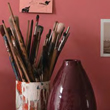
Reds
Soft strawberry reds are warm, comforting and easy to live with. The influence of yellow conjures up an image of ripe fruit, berries and summer sunshine.
-
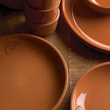
Oranges
Warm tans and browns are inspired by the natural tones of clay and wood - homely, tried and tested shades that feel authentic and trustworthy.
-
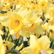
Yellows
Fizzy pale lemons and limes are happy, animated shades that bring a smile to the face - light and playful they can lift and enliven even the darkest interiors.
-
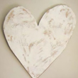
Warm Neutrals
Green tinged neutrals are inspired by natural clays and earth tones, intriguing delicate shades with a sense of timeless beauty.
-
Greens
Subtle and greyed off shades are those found in the vegetable patch - enriching shades that feel familiar and nourishing.
-

Blues
Vibrant turquoises and teals are influenced by sunny optimism and molecular organisms, which result in a palette which is both clear and bright.
-
Violets
These very deep understated shades are reminiscent of minerals and shadows, colours of great character that do not need to flaunt their beauty.
-

Cool Neutrals
Pure neutral greys are the colours of stone and concrete - architectural shades inspired by urban architecture, construction and planning.
