Exterior colour schemes made easy with Weathershield
The Dulux Trade Weathershield Professional Colour Card brings together an exclusive selection of colours, designed to inspire contemporary exterior colour schemes that will stand the test of time.
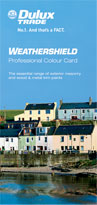
The Weathershield Professional Colour Card has been developed by the Dulux Trade colour experts to provide a selection of colours ideal for exterior schemes. The range contains 105 exterior masonry colours which offer durability and stability, and 21 complementary colours for exterior wood and metal. By using the new colour card, decorators can guide customers towards an impactful, long lasting colour scheme with ease.
Ian Bradshaw, Group Brand Manager for Dulux Trade said, “When it comes to achieving long lasting good looks on an exterior project, colour choice can play just as important a role than product formulation.
“With Dulux Trade Weathershield, decorators can be certain that any exterior work will stay looking its best for longer, by building on the superior durability offered by Weathershield products with a colour range that is sure to stay true.
“By developing the new Weathershield Professional Colour Card, Dulux Trade has taken the hard work out of exterior colour scheming.”
Exterior colour
Painting the exterior of a building not only offers it protection from the elements but in the same way that we impose our preferences and personalities on an interior, it offers us an opportunity to make a statement.
The past
Historically all British villages, towns and cities were built from indigenous materials which gave a pleasing sense of identity and diversity to all regions of the countryside and with local earth pigments forming the basis of regional colour schemes - e.g. Suffolk pink or Cotswold cream.
More vivid colours were available but at great cost and often hundreds of times more expensive than local ones. Strong, bright greens, Prussian blues, crimson and vermilions reds signalled class, status and money when used on building facades. In combination with expensive dressed stone the resulting contrast of colours with their natural surrounding ensured that these buildings stood out and were clearly identifiable.
When dressed stone was neither available nor affordable frequently buildings were rendered and then painted in shades that mimicked these more expensive materials - Portland stone, York stone, Sandstone. This became the norm for whole terraces of classical looking townhouses in London and our larger cities.
The location
We are always charmed by the typical and appropriate colours of other places - the bright blue and white of the Greek islands, the mellow ochres and terracottas of a Tuscan hamlet or the pretty pastels of a Riviera fishing port. In town and country colour should be tuned to our culture, landscape and climate. The most successful masonry shades for the UK are subtle and soft in keeping with our daylight and vegetation. Very bright Mediterranean pastels can be too clean and bright for use here and end up looking tawdry and cheap.
In France some 40 years ago, leading colour consultant Jean Philippe Lenclos noticed that the traditional colour of French villages seemed to communicate a real sense of place. In stone built towns and villages the door and shutter colours tended towards off whites, creams and pale greys whilst in brick built ones richer greens, blues and browns were used. Following this observation he colour surveyed the whole of France and created regional colour palettes appropriate to each area.
For window and door frames Lenclos suggested using a lighter or deeper version of the masonry shade and then highlighting the whole with a bright door colour. These were chosen from local plants and flowers as being part of the landscape and therefore the indigenous palette.
For window and door frames Lenclos suggested using a lighter or deeper version of the masonry shade and then highlighting the whole with a bright door colour. These were chosen from local plants and flowers as being part of the landscape and therefore the indigenous palette.
How to colour scheme
Colour also defines territory and denotes ownership in a visual and easily identifiable way. We can act in a community spirited way and draw up our own colour plan for our street or neighbourhood getting together with friends and neighbours in order to create a collection of colours or we can do our own thing and create a street where various contrasting personalities are visible.
Modern paints are available in such a wide range of pleasing and appropriate colours that both these approaches are now very easy to achieve. The most successful schemes are those that keep it simple and use no more than three colours for masonry, window frames and doors. Our rich array of front door colours are always much admired by visitors to our shores as they differ quite dramatically from what others do.
Think of the masonry shade as a background or canvass to highlight with window and front door colours. Again keep it simple and try to paint the whole faade in a single shade unless it is a property that has accent areas of other materials - maybe decorative brickwork, pebbledash or timber cladding. A well chosen masonry shade will look smart and timeless - try to avoid high fashion interior colours like lilac or bright pink as they will date quickly and look rather inappropriate for external use.
In most cases getting as much light into the interior of a home as possible is something that we all consider to be desirable. Painting the widow frames in a pale shade will help to reflect the maximum amount of light into the interior. In the past window frames were frequently painted black or a very dark shade - this can look very smart on period properties.
Front doors and garage doors are areas that can take a bolder colour as they are only seen in a relatively small amount much in the same way as you might accent a room with brighter cushions or lampshades. A rich and colourful front door adds an air of welcome to any exterior and acts as a strong focal point for the house - this can often be accentuated by painting a gate in a similar or matching shade.
Extra accent colour can always be added seasonally by means of planters, pots and plants. Well chosen door furniture and outside lighting are other ways that a simple facade can be given a touch of class and drama. Disruptive and ugly features such as piping can be disguised by painting in an exterior gloss shade that matches or closely links to the masonry so that it blends into the overall facade. Otherwise a simple dark colour looks best - it is better not to draw attention to them by painting in a bright colour.
Download
Weathershield Professional Colour Card. Order your copy now!
Latest news stories
- Dulux Trade reveals new in-store colour resource »
- Glidden Trade launches new 'Can Do' campaign »
- Racing Car Champions »
- Sikkens launches new website »
- Sikkens launches high end woodcare book for specifiers »
- Championship rally driver helps promote events »
- Glidden Trade helps specifiers on a budget »
- 2011 Colour Seminars for Architects »
- Lucky winners get decked out with Cuprinol Trade »
- Cuprinol Trade reformulates range of Wood Preservers »
- Dulux Trade paint unveils new Fast Matt and Supermatt colour card »
- Dulux Trade Paint named as one of the top business superbrands »